Wednesday, 20 October 2010

Day 28: Contextual lecture and St Ives

Contextual Lecture- Modernism

I fund that as I have not done alot of Art History, if any, that I am really interested in learning about art movements and how it has developed.
The Main Themes in Modernism:
  • Freedom from realism
  • Delight in the light of the outdoors
  • Surface and abstraction
  • Truth to materials
  • Advances in engineering, global travel and exploration
  • Influence of global travel
  • New technology and materials
  • Japanism 
  • The influence of 'The Primitive'
  • Science
  • Inner Necessity
  • American/abstract expressionism
Below are artworks form my favourite artists mentioned in the lecture.
 I really enjoy this piece by Magritte, 'Collection Invention" as it is very powerful at first sight. It captures the viewers eye and leads them into a thought process. The irony in the concept is great as its a take on a mermaid but in an unconventional way.
The main reason I like this scultpure by Rodin is because it shows the material in its natural state before any work has been done to it and then on top is an amazing sculpture showing the real contrast between the material after he has worked on it. It shows the beauty and softness in which it can be made into but keeping the purity below.

After the lecture I was very fortunate to have the chance to travel to St Ives and also look at St Micheal's Mount. I wanted to go onto the island but as arrived late the tide had already come in. Both places are beautiful and I would love to return to St Micheal's Mount on a morning as when the tide is out a pathway to the island appears.
Below are photo's which I have taken today but not edited yet.


Tuesday, 19 October 2010

Day 27: Fabric and Form continued

After really enjoying the first day of fabric and form I was looking forward to continue working on it. My research into Stephen Hann also really helped as his work, similar to mine, uses unconventional materials.

My A1 worksheet really helped me throughout the day as my sketches I made throughout the week meant I had lots of inspiration and ideas. I found that once I had the basic structure I could experiment with materials and found that some mistakes then turned into good ideas.

I encountered afew problems when sewing the rubbish bags and bubble wrap due to the thickness of the material in the sewing machine. The main issue with my dress is that it can only exist on the mannequin. Whilst I had sewn parts, I had only pinned other areas and would be very hard to sew, also the drape of the dress is not structured or sized for a person.

Therefore I have made a great emphasis in getting good photographs of my dress as this is the only record I will have. I have used an installation another group made yesterday as a background setting for the shoot.


Monday, 18 October 2010

Day 26: Volume and Space

Volume and Space
Today's brief was very vague allowing students to be creative on all scales. We chose our own groups which I was really pleased with as it allowed me to work with hard working and imaginative people. I found the initial stage of coming up with a concept very natural. I immediately analysed the text and was able to pick out key words to develop. As a group we decided on a concept which we thought would use the space and be very striking. Below are pictures I have taken throughout the day including some abstract pictures which I find very interesting. Overall I really enjoyed creating an installation today and even though it did not turn out how I imagined it is very effective.

Key Words: Head, Peasebottom, Cobweb
Materials: Wood, Seaweed, Chicken wire, Cardboard tubes, Shells and Tape


Friday, 15 October 2010

Day 25: Futures Lecture

Patrick Shanahan- Photography


I found today's lecture interesting as it was a refreshing contrast to fine art future lectures. Patrick Shanahan, a photographer, mainly showed long exposure and flash photographs taken as part of his Esperantis project from 1998-2001. I found these images very vibrant in colour with the juxtaposition of the artificial and natural light.


For another project Shanahan worked with the environment and captured physical processes with vibrant detail. This reminded me of my study into the process and the strong impact made by the detail and saturated colours. Below is the montage I created on Photoshop using photographs I have taken in a rust scrapyard and edited.


 This afternoon I continued work on my typography project by using the Hut at Wellington Terrace to make a large scale final piece. This final piece was created by using electrical tape to spell out the word Perspective on the wall. I was able to easily scale up the measurements as I had created a small scale version afew days ago. I really enjoyed this project as I had never worked on such a large scale before. As this piece of work is only temporary I have had to record it by taking pictures. After uploading them I have played around with effects on Photoshop to create very striking edited photos.


Thursday, 14 October 2010

Day 24: Typography continued

Today I continued with the Typography project and really enjoyed experimenting in ways I could present the word 'Perspective'. I had my idea and the type face but I was not sure how I could create the installation. My plan was to write on the corner of a wall but for obvious reasons I was not allowed to ruin the studio walls! By talking to Dion, a typographer, it allowed me to explore and imagine otherways in which this could be possible.
One idea was to use electrical tape on the wall and I would be able to get straight lines aswell. I explored this idea by using two a1 sheets of paper and drawing the word perspective in my chosen type face. I then placed them in a room corner to see what the effect would be and I was very pleased with the outcome as the word really accentuates the perspective. Below is my creation.


Another idea was to create a anamorphic projection. I have researched a little into anamorphic projection and mainly found it was a 3D effect of painting on the ground. The example I found and most enjoyed is the Channel 4 Advert where it is a panning shot of random shapes in the sky but when the camera hits a certain angle it shows '4'. I have tried to re create this with the word perspective using plant labels.
Below is the film I created and pictures exploring 'Perspective' with anamorphic projection.

Using Photoshop I have painted on the word 'Perspective' to highlight how the video works


Below are some examples of anamorphic projection,


Wednesday, 13 October 2010

Day 23: Contextual Lecture and Life Drawing


Making Things

I have just had a lecture on making things and normally I genuinely look forward to the contextual and futures lecture but today I was really disappointed. I normally find I am interested in the topic, and hearing it was 'making stuff' I had high hopes! It turned out that none of the artists really amazed me, i'm not sure if it was how the lecture was presented or for a different reason but I found myself doodling alot!
Areas covered included furniture, architecture, fashion and a little on installation.

Artists, such as Robert Smithson (land artist) were mentioned and I remembered seeing a picture of an artwork by Christo called Surrounded Islands which I wanted to research into (picture to the right). I found out that this artwork was created in 1980-83 and this link described it as "a work of art which underlined the various elements and ways in which the people of Miami live, between land and water". I think the scale on which this artwork was created is very spontaneous and appealing and I think it really links into the idea of how things are made and on different scales.

I was amazed with the architecture of Falling Water and how the artist had used the environment as inspiration whilst also retaining a very modern theme. The building is made of the natural stone to blend into the surroundings and the light concrete to extend the waterfall. I also appreciate how the architecture has been designed for a person as they can look over the edge and straight into the pond and be at one with nature.
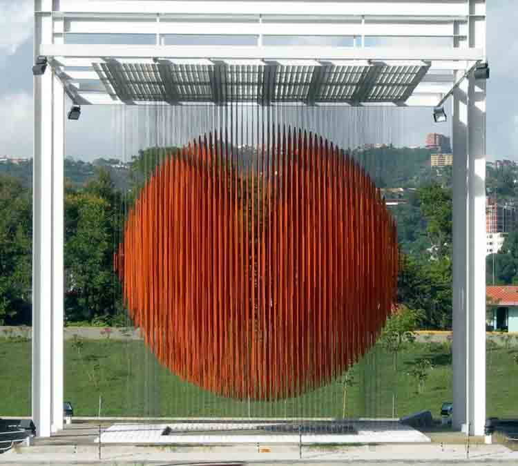
Jesus Soto was another artist mentioned but for his installations. An Installation creates an environment for the viewer. I think installations can have a bigger impact as it gives the audience an experience. This installation shows the variety of scale in making things aswell as the abillity to experiment with materials.


Life Drawing
I was really looking forward to my second life drawing workshop as I had been practicing using the measurement technique, to turn up and find that the first drawing had to be quick and rough with lots of marks! I really struggled with this as I could not get things in proportion and would do lots of shading to then realise that the body part was in the wrong place but I did manage to work on the background well (probably as it was still life!). The next stage we had to go back with a rubber and give the sketch areas of light and then work back into it making sure proportions were right. I found that doing the quick initial sketch helped me get the proportions as I had something to work from and adapt which was a quciker method than to map out exactly where everything was. I found this session really stressful because as soon as I got one thing in the right place I would notice something else was wrong, so it was alot of trial and error at first. At the end of the session I had managed to work on the top half of the body but struggled the most with the bottom half getting the perspective and proportion right. Below is a picture of my drawing.


Tuesday, 12 October 2010

Day 22: Typography

Typography

Type becomes the visual excitement

Task:
  • Study and image and write 15 words which you relate to the image.
  • From these 15 chose 5 words to develop.
  • Using these 5 words we were free to create anything type of artwork but must include the words in some way.
Analysis
I have enjoyed the workshop today as we are constantly using fonts, words and symbols but never explore the meaning behind them. I had never considered using type in artwork as previous projects where I have seen it, it gives the work a messy finish, probably due to the lack of expertise. When looking at other works which include fiona banner and Alan Kitching, I have really been able to appreciate how to manipulate type as an artwork itself. I used the website dafont to use fonts that already existed as a starting point for my work. I was not sure what I wanted the final outcome to be wether it was a garment, installtion painting etc. so in my initial ideas i tried to include a variety. When looking to develop one I am keen to create an installation representing the effect of perspective. My idea is quite adventurous so I need to think of ways in which I will be able to produce it on a large scale. We also have thursday working on this project.

Monday, 11 October 2010

Day 21: Fabric and Form

Fabric and Form

Tasks:
  1. create 3 models/ forms with structure out of fabric and other materials
  2. develop one or all of the forms 
Ways in which you could create form
  • piping
  • folding
  • laser cutting with repetition 
  • cutwork
  • exaggerating form
  • use other materials
  • darting
Artists Inspiration
Hussein Chalayan 2000-I had briefly seen this amazing piece of structure before but by studying into form I have really begun to appreciate not only the design but the multi-functional use for this skirt which turns into a table top by Chalayan.


Today has been my most enjoyable day so far. I feel like I could really explore the properties of fabric freely and produce an interesting form. I found that the more stitching I made, the stronger the form became. Other things I noticed were that the form alone looked unfinished but when placed on a mannequin as a sleeve or part of a garment it took a different shape and looked like it had an actual use. Each stitch I made, gave it a skeleton. Whilst everyone was happy using scrap pieces of material, I wanted to use a variety to create different textures and forms, therefore bought some interesting and unusual materials (had to improvise as on a low student budget!) . When getting advice from my teacher they suggested that I needed to develop the form side instead of textures. After this comment I noticed that on previous occasions others had also suggested this to me, therefore highlighting an interest I have into texture which I was not aware of! Whilst working today I was constantly referring to my worksheet I created to help with ideas, developments, problem solving and noting techniques. This will help me when it comes to continuing work on my garment and I look forward to finishing the garment next week.