Saturday 30 October 2010
Friday 29 October 2010
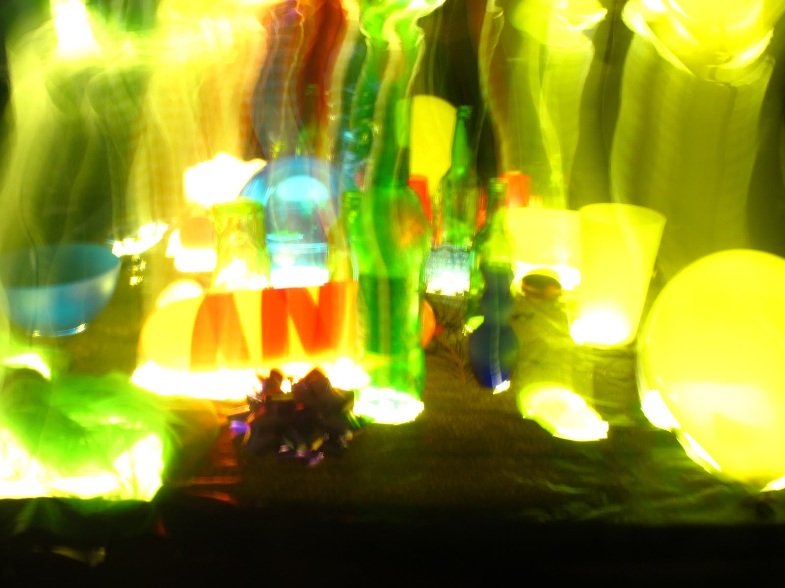
Day 35: The Eden Project
Today we had a trip to The Eden Project for the day. I was very excited as I have never been there but heard amazing things form my previous art tutors. When I arrived I was truly gobsmacked by the architecture and placement within a huge valley of the Eden Project. Once inside the biomes I was transported to a whole other country! The atmosphere within these environments was so captive that it was a very inspiring place. I found that I was mainly attracted to the wide range of colour. Below are photographs which I have taken and edited using Photoshop.
Another main interest of the day was being able to handle Owls as I have a personal interest in owls and their beauty. I find the faces very characterised and expressionate mixed with the intricate detail in the feathers.
I found it great that the other day we had a lecture which mentioned Peter Randall-Page's artwork, 'Seed', and then afew days later I was able to see it for myself.
Whilst in the rainforest biome I experimented with long exposure on the waterfall to try and capture the movement.


Thursday 28 October 2010
Day 34: Print Workshop

I really enjoyed the process, making and final outcomes of today. I found that whilst I enjoyed printing with basic stencils and trying different techniques, I preferred experimenting to brush stroke and different marks to make a range of surface patterns.

This is a picture of afew final pieces which were displayed for the open day. I am pleased with the overall look and found that as I had used a restricted colour palette all my pieces worked well next to each other. Whilst studying others artwork I noticed that colour could be used in a strong and vibrant way aswell as subtle mix giving the print a different tone.

Above is a print I made using a metal sheet which I then layered ink onto and worked into using a range of mark making techniques. To create different effects I used stencils, cardboard pieces, brushes and other tools. By using the printing press I was able to produce this on a large scale which meant I could really use alot of detail.

Above is a photo of another print I made. This is one of my favourites as it is a simple process but what is made is very beautiful. By splashing water onto the piece of metal covered in ink I was able to produce a spontaneous print.

I created this print by simply putting through a thin piece of bubble wrap on the printing press. The first print I used too much ink and therefore did not produce much detail but the next few showed all the detail of the bubble wrap popping which is very intricate and detailed.
Wednesday 27 October 2010
Day 33: Contextual Lecture and Life Drawing

Post Modernism
- everyday banality
- cross cultural references
- democracy
- semiotics
- material playfulness
- feminism
- environmentalism

Another series of artworks I think have strong conceptual ideas are Yasumasa Morimura and his outspoken artwork.
Below is an example of how Morimura would incorporate himself into traditional paintings to put across a different message.
The right is the original by Manet.


Another Artist mentioned was a name I recognised, Susan Philipsz. I recognised her as I have recently been looking at artworks up for the Turner Prize. She creates 'sound art' which changes a buildings architectural nature through sound. I think her location is key to her artwork and she has been very selective as played music under a bridge and in Tesco. Her artwork is inspirational as it reaches out to all audiences, such as shoppers in Tesco, not actually going to see artwork but stumbling into it.

Ori Gersht is another amazing artist who takes inspiration from old paintings and does a modern day response. He uses film and stills to capture a bullet piercing through still life. To the right is the original painting by Juan Cotan where Gersht got inspiration.
This is the link to Gersht's film clip with a bullet going through still life- http://www.youtube.com/watch?v=0KMsrE3e30k
Whilst looking at the clip above I also found another video which is similar but think the message is really effective- http://www.youtube.com/watch?v=emP5D9Klssg&feature=related

 Peter Randall was mentioned as an artist who is inspired by the environment but uses unconventional places. A piece of his work can be seen at the Eden Project which I hope to go to in the near future.
Life Drawing
Tuesday 26 October 2010
Day 32: Mini Workshops
Aspects of Composition
I enjoyed this workshop as we were able to put across opinions on artwork and indentify key facts to composition and to remember when studying artwork you should decode the image.
To remember the key points I have made up a rhyme:
Layout
Space
Persepective
Scale
Overlap
Tone
Colour
Little Spiders Place Snails On The Cupboard
Print Making
For print we started making stencils for the main workshop. I used the objects from the colour workshop to inspire me and made stencils both abstract and simple. I want to focus on the textures you can create using printing as I am interested in the surface texture.
Book Binding
This was really exciting as I had seen books which the group before made and they looked amazing. We just went though the process roughly of making a book and then looked at some artists books.


I liked the interaction idea in Plinitude by M.L Van Nice, as it involves the reader.
I was amazed by diderot/doubleday/deconstruction by Scott as it makes the viewer think twice about how this image was created. It gives the book depth and pattern but keeps the simple idea of a picture.
 When I saw Spirit book by Suan Kapuscinski Gaylord it reminded me of an artwork I saw at the Royal Academy Summer Exhibition 2010 where a book was being protected by sticks around it. This book could be seen as the sticks coming out of the book, as it is spirited.
Photography
I really enjoyed the photography workshop as I found the teacher very helpful and intriguing to listen to. His stories form the business were very exciting and funny, but also showed his experience and wide knowledge within the subject area. He described photography as "archiving a disappearing world" which I thought was a lovely description and how representation within the photography/film world is very important. He used the amusing example of when Picasso was discussing his wife.
I enjoyed this workshop as we were able to put across opinions on artwork and indentify key facts to composition and to remember when studying artwork you should decode the image.
To remember the key points I have made up a rhyme:
Layout
Space
Persepective
Scale
Overlap
Tone
Colour
Little Spiders Place Snails On The Cupboard
Print Making
For print we started making stencils for the main workshop. I used the objects from the colour workshop to inspire me and made stencils both abstract and simple. I want to focus on the textures you can create using printing as I am interested in the surface texture.
Book Binding
This was really exciting as I had seen books which the group before made and they looked amazing. We just went though the process roughly of making a book and then looked at some artists books.


I liked the interaction idea in Plinitude by M.L Van Nice, as it involves the reader.
I was amazed by diderot/doubleday/deconstruction by Scott as it makes the viewer think twice about how this image was created. It gives the book depth and pattern but keeps the simple idea of a picture.

Photography
I really enjoyed the photography workshop as I found the teacher very helpful and intriguing to listen to. His stories form the business were very exciting and funny, but also showed his experience and wide knowledge within the subject area. He described photography as "archiving a disappearing world" which I thought was a lovely description and how representation within the photography/film world is very important. He used the amusing example of when Picasso was discussing his wife.
Picasso, speaking to an earnest philosopher.
Philosopher: "Mr. Picasso, the picture of your wife is striking but her face is quite distorted."
Picasso politely asks, in return, to see the philosopher's wife; the latter proudly removes the photograph from his wallet.
Picasso: "Indeed, your wife is extraordinarily beautiful, but I see she is very, very small."http://muse.jhu.edu/journals/perspectives_on_science/summary/v007/7.2galison.html
Monday 25 October 2010
Day 31: Finds Project
Colour Workshop
We all brought in 10 coloured objects, whic were layed out on the table going from red toblack. Then we re-aranged them and moved complimentary colours next to each other and also in order of tone. I found that it was most effective when the deepest colours were put next to each other to show a strong contrast.

Next we had a mini lecture on artists collections which used objects in a specific way. I was really amazed by the work of Cornelia Parker who uses materials she finds to create artwork. In one project she blew up a garden shed and has used the fragments to create a breath taking hanging piece which produces very unique shadows (pictured below left). I also like the fact that it is on a large scale as it puts emphasis on all the small details.

 Noble and Webster were other artists mentioned who create shadow projections using 'junk' (pictured above right). I found this piece very unusual as at first glance it does just look like a pile of junk whereas the shadow produced is beautiful and very precise. I was surprised that when looking back at the pile I stile could not identify the outline which shows the power and importance light has on a piece of artwork. This also reminded me of the John Lewis Christmas advert in 2007 (link below).
http://www.youtube.com/watch?v=g24W5pPsBts&feature=player_embedded
Below are photos I took throughout the day and activities responding to the objects.


 I found that working with still life was really easy to manipulate and change to give a different styles. I also started to play around with settings when taking photographs of the objects on the light box by using long exposure and also a colour effect.
We all brought in 10 coloured objects, whic were layed out on the table going from red toblack. Then we re-aranged them and moved complimentary colours next to each other and also in order of tone. I found that it was most effective when the deepest colours were put next to each other to show a strong contrast.

Next we had a mini lecture on artists collections which used objects in a specific way. I was really amazed by the work of Cornelia Parker who uses materials she finds to create artwork. In one project she blew up a garden shed and has used the fragments to create a breath taking hanging piece which produces very unique shadows (pictured below left). I also like the fact that it is on a large scale as it puts emphasis on all the small details.


http://www.youtube.com/watch?v=g24W5pPsBts&feature=player_embedded
Below are photos I took throughout the day and activities responding to the objects.


Saturday 23 October 2010
Friday 22 October 2010
Day 30: Futures Lecture and Exhibition
Gary Allson- Designer
 This lecture I found very helpful in terms of helping me to understand life choices. Gary Allson went through each stage of his life with us which I found most intriguing as he has changed his life path many times. After degree level he went into a design job, then theatre props, designing furniture, MA at Royal College of Art and then traveled to Bangladesh to teach. This just proves that I should always look for better opportunities in life and never have to follow just one pathway. This has really helped me open my options as I am finding it difficult to chose a subject for my degree but I now realise it does not have to be a subject for the rest of my life but a subject I enjoy and can gain many skills from in a variety of areas.

I found his work basic but stylish and I think that is the right aim for design qualities. I am also a big fan of the woodwork he made through pattern as I find the surface texture very unusual. This lecture reaffirmed the idea in which art as a job is a very hard business as Gary Allson made the final model for the Angel of the North, which Antony Gormley later sold for over £1 million but Gary Allson didnt get any commission.
Keith Sparrow- Freelance Illustrator
 I was not a big fan of illustration to begin with and I left the lecture feeling the same. The majority of the lecture I found rather average but some quotes like "art should be messy, not accurate" I completely agreed with. He also mentioned how important life drawing is in all aspects of art which I als agree with. Keith Sparrow mentioned that he was inspired by Todd Schorr in illustration. I have done further research into this artist and found his word very ironic and comical. Whilst I am not usually a big fan of illustration I found that because he has taken the popular subject of famous cartoon characters it means that all ages and audiences can appreciate his work.
After the lecture I went down to the Marine School to have a look at the final exhibition. I was really impressed with the amount and quality of work we have produced. I was very proud when I walked in and my fabric piece was at the entrance of the exhibition. My typography piece was also displayed.


 This lecture I found very helpful in terms of helping me to understand life choices. Gary Allson went through each stage of his life with us which I found most intriguing as he has changed his life path many times. After degree level he went into a design job, then theatre props, designing furniture, MA at Royal College of Art and then traveled to Bangladesh to teach. This just proves that I should always look for better opportunities in life and never have to follow just one pathway. This has really helped me open my options as I am finding it difficult to chose a subject for my degree but I now realise it does not have to be a subject for the rest of my life but a subject I enjoy and can gain many skills from in a variety of areas.
I found his work basic but stylish and I think that is the right aim for design qualities. I am also a big fan of the woodwork he made through pattern as I find the surface texture very unusual. This lecture reaffirmed the idea in which art as a job is a very hard business as Gary Allson made the final model for the Angel of the North, which Antony Gormley later sold for over £1 million but Gary Allson didnt get any commission.
Keith Sparrow- Freelance Illustrator
 I was not a big fan of illustration to begin with and I left the lecture feeling the same. The majority of the lecture I found rather average but some quotes like "art should be messy, not accurate" I completely agreed with. He also mentioned how important life drawing is in all aspects of art which I als agree with. Keith Sparrow mentioned that he was inspired by Todd Schorr in illustration. I have done further research into this artist and found his word very ironic and comical. Whilst I am not usually a big fan of illustration I found that because he has taken the popular subject of famous cartoon characters it means that all ages and audiences can appreciate his work.
 After the lecture I went down to the Marine School to have a look at the final exhibition. I was really impressed with the amount and quality of work we have produced. I was very proud when I walked in and my fabric piece was at the entrance of the exhibition. My typography piece was also displayed.


Thursday 21 October 2010
Day 29: Setting Exhibition
Today has been all about setting up the 'Making Exhibition'. We were told to bring along the three projects; kit, fabric and typography. I brought along my typography and fabric projects but I have personally chosen to not enter my kit project into the exhibition as for me it was not about the end product but the process. I then put my name down to be a kit selector as my own was not in the collection I thought I would therefore have a non-bias view.
 It turned out not many people had entered their kit projects so we didn't have to select anything and just used them all.
I also went back to the installation we made and saw the other groups development. I thought it was very comical as on the day we made it we were lying and sitting underneath it as we found it nice to view from different angles and acted like a sanctuary and then without even talking to the other group they created a person to lay underneath it! Shown in the picture to the right.
As I therefore finished early today I started to edit some of the photos from St Ives. There were two photos (below) which I was editing on photoshop and doing the usual corrections, I was then experimenting with colour as these two were very effective in black and white after I had incresed the contrast. Im not a big fan on using black and white effects but on these photos I think it works to their advantage.


Subscribe to:
Posts (Atom)